A Guide to Color Psychology in Web Design: Precisely Matching Brand and User Needs


Websites have become a core battleground for brands to communicate with users. Color, as the most direct visual language in web design, is not merely a decorative element, but also possesses a powerful psychological influence. A color scheme that aligns with brand attributes and user needs can instantly capture user attention, convey core brand values, and even influence user decision-making. East Tech's Hong Kong team has been deeply involved in web design for 15 years, witnessing countless brands achieve online image upgrades and conversion rate improvements through the scientific application of color. This article will start from the core logic of color psychology, dissecting how to accurately match website colors with brand and user needs to create a high-quality website that is both distinctive and user-friendly.
Color Psychology: The Silent Communicator of Web Design
Color psychology is the study of the influence of color on human emotions, perception, and behavior. Its core lies in the fact that color can trigger subconscious reactions through visual stimulation. In web design, this reaction directly impacts a user's first impression of a brand and their browsing experience: warm red evokes enthusiasm and a sense of urgency, suitable for promotional scenarios; calm blue conveys trust and professionalism, making it a top choice for financial and technology websites; and refreshing green symbolizes health and nature, often used by health and environmental brands.
Unlike random color piling up, excellent web color design must be based on the dual goals of conveying brand personality and meeting user psychological expectations. For example, trendy brands targeting young people can use high-saturation contrasting colors to create a sense of vitality; while high-end luxury brands tend to use low-saturation Morandi colors or classic black, white, and gray to highlight texture and style. East Tech, when providing customized web design services, always uses color psychology as a core design principle, ensuring that colors are not only aesthetically pleasing but also serve as a silent bridge for communication between the brand and users.
Matching Brand Attributes: Defining the Core Brand Identity with Color
Brand attributes are the fundamental starting point for color selection. Every brand has its unique positioning, value proposition, and target audience. Colors must be strongly linked to these attributes, allowing users to quickly recognize the brand's personality visually.
For technology brands, such as internet companies and electronics manufacturers, blue and purple are common choices. Blue symbolizes rationality, innovation, and reliability, aligning with the core attributes of technology products—precision and efficiency. Purple, on the other hand, carries a sense of mystery and forward-thinking, suitable for brands emphasizing innovative technologies. East Tech has designed websites for numerous technology companies, using a combination of deep blue and light gray tones, accented with touches of bright color, to highlight the brand's professionalism while avoiding a somber feel.
For educational institutions, such as schools and training platforms, color choices need to balance stability and vibrancy. Gentle colors like light blue, green, and beige are preferred, as they provide a comfortable and relaxing browsing experience, fitting the core needs of education—knowledge delivery and growth guidance. When designing websites for several primary and secondary schools and universities in Hong Kong, East Tech adjusts the colors according to the school's educational philosophy: traditional prestigious schools tend to use classic colors like deep red and navy blue to highlight their historical heritage; innovative schools incorporate bright colors like light green and light orange to reflect openness and vitality.
For retail and consumer brands, colors must closely reflect product attributes and consumption scenarios. Food brands often use warm colors like orange and yellow to evoke appetite and a sense of pleasure in users; skincare brands frequently use pink, white, and light green to convey a gentle, natural, and healthy product philosophy; fashion brands can flexibly adjust their colors according to their style, with sweet women's clothing brands often using pastel colors, while streetwear brands favor contrasting and bright colors.
Meeting User Needs: Optimizing User Experience and Decision-Making with Color
Webpage colors should not only represent the brand but also understand the user. Users of different ages, genders, and industries have significantly different color preferences and psychological acceptance levels. Only by accurately meeting user needs can page dwell time and conversion rates be increased.
From an age perspective, younger users (18-30 years old) are more receptive to novel and personalized color schemes; high-saturation contrasting colors and gradient designs can quickly attract their attention. Middle-aged users (31-50 years old) prefer stable and understated colors, such as dark blue, gray, and brown, as these colors convey a sense of security and professionalism that aligns with their consumer psychology. Elderly users (50 years and older) are better suited to high-contrast, low-saturation colors to avoid overly glaring colors that strain their vision, while ensuring sufficient contrast between text and background colors for easy readability.
From an industry perspective, B2B users (corporate clients) prioritize efficiency and professionalism; their website colors should be simple and stable, avoiding excessive decorative colors that interfere with information retrieval. Common color combinations include dark blue + gray and black + light gray. B2C users (mass consumers) place greater emphasis on emotional experience; their colors can be richer and more diverse, evoking emotional resonance. For example, warm light pink and light yellow are used for baby products, while vibrant orange and green are used for outdoor sports brands.
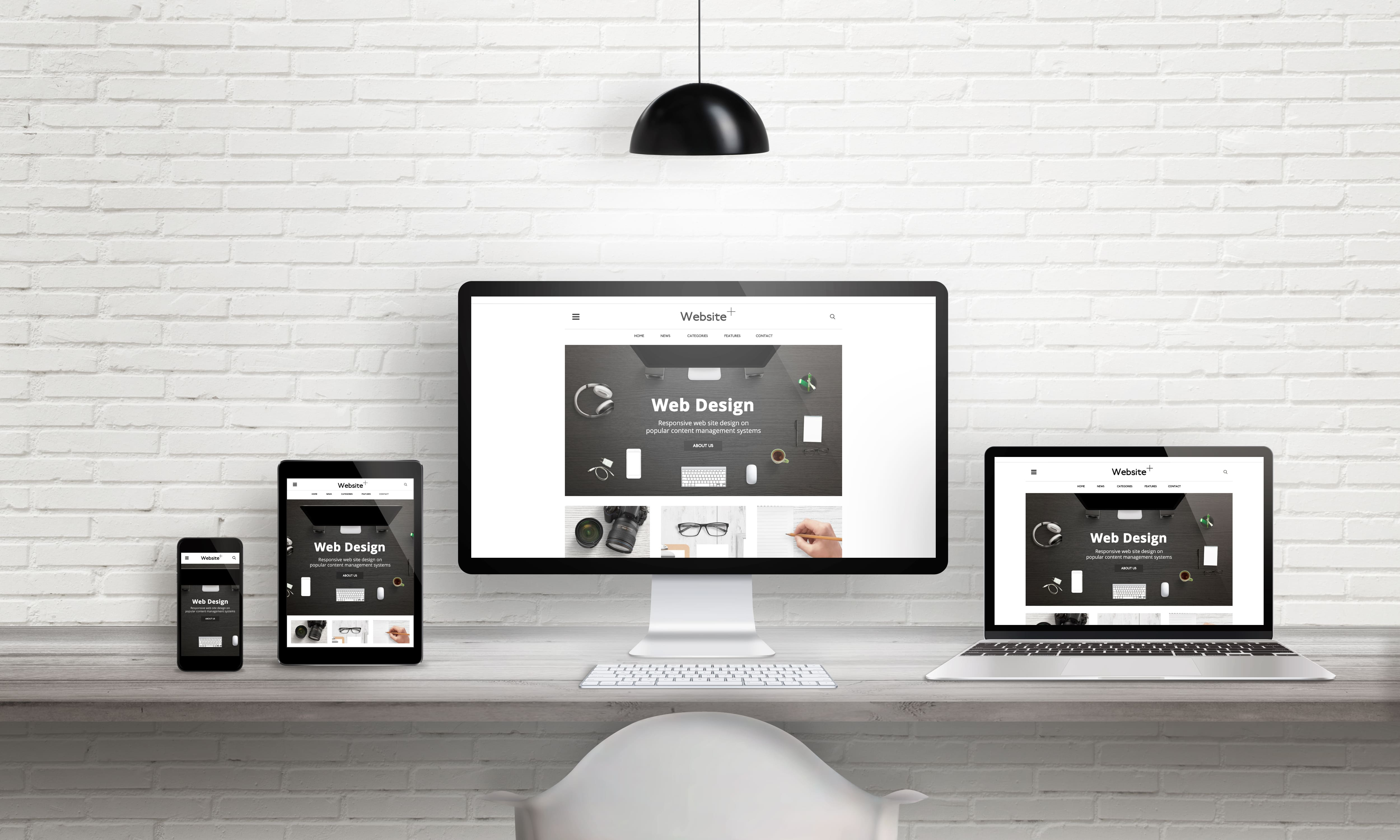
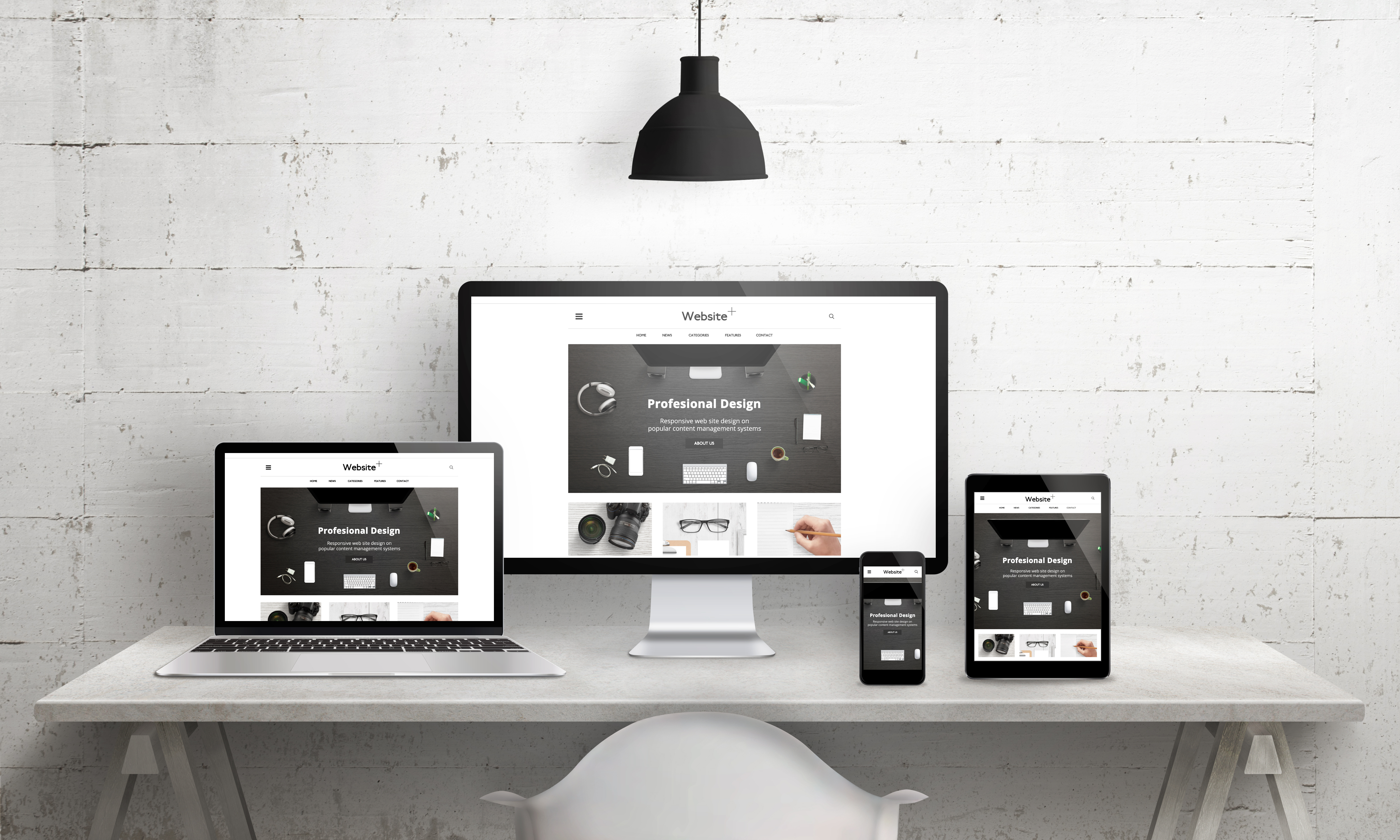
Furthermore, the practicality of color is also crucial. In responsive web design, it's crucial to ensure consistent color display across different devices (computers, mobile phones, tablets) to avoid color distortion due to device differences. Simultaneously, color inclusivity must be considered, catering to the browsing needs of users with color vision deficiencies or color blindness. Through appropriate color contrast and icon support, all users can smoothly access information. East Tech conducts multiple device tests and color calibrations during the design process to ensure that colors conform to psychological principles while possessing strong practicality.
Color Matching Practice: The Golden Rule of Balancing Aesthetics and Functionality
Excellent web color design is not a solo performance of a single color, but rather a harmonious combination of multiple colors, adhering to the golden rule of a primary color setting the tone, secondary colors complementing, and accent colors adding highlights.
The primary color is the core color of the webpage, occupying 60%-70% of the page's color scheme. It is usually consistent with the brand logo color, defining the brand's tone. For example, Vitasoy's official website uses the brand's classic red as its primary color throughout the entire page, strengthening brand recognition; Swarovski's official website uses crystal-like white and light blue as its primary colors, highlighting a noble and pure brand image.
Secondary colors comprise 20%-30% of the page's color scheme, used to compensate for the monotony of the primary color and enrich the page's hierarchy. Secondary colors should harmonize with the primary color; they can be chosen from the same color family (e.g., dark blue + light blue) or contrasting colors (e.g., blue + orange), but saturation should be controlled to avoid competing for attention with the primary color. For example, when designing a website for Shide Financial Group, East Tech used dark blue as the primary color and light gray as the secondary color, maintaining the brand's stability while making the page's hierarchy clearer.
Accent colors comprise only 5%-10% of the page's color scheme, used to highlight core elements such as buttons, links, and key information, guiding user actions. Accent colors should be chosen to contrast strongly with the primary and secondary colors. For example, if the primary color is blue, orange or red can be chosen as accent colors, but multiple accent colors should be avoided to prevent visual confusion.
Conclusion: Let color become an invisible driving force for brand growth
The psychology of color in web design is essentially an organic combination of user-centered design thinking and psychological principles. A color scheme that precisely matches brand attributes and user needs not only enhances the visual appeal of a website but also strengthens brand recognition, evokes emotional resonance with users, and guides user decisions, becoming an invisible driving force for online brand growth.
As a well-established brand with over 6,000 certified clients and a 99.99% positive feedback rate, East Tech, with 15 years of web design experience, consistently integrates color psychology into its customized design process. From brand attribute analysis and user profile breakdown to color matching practices, we comprehensively create website designs that are both distinctive and conversion-enhancing. Whether you are a listed company, government agency, school, or SME, if you want to upgrade your website image and improve user conversion rates through scientific color design, visit the East Tech website: https://www.East Tech.com.hk/cn/ or call 23313344. Let our professional team tailor a web design solution that meets your brand and user needs, empowering your brand's online development with color!