10 Common Website Design Mistakes Revealed! From Visuals to User Experience, We'll Break Down How to Avoid Them


Websites have long been a crucial bridge for businesses to connect with customers and a direct reflection of their brand image.A high-quality website can bring traffic and convert customers;conversely,small design errors can cause potential customers to leave in an instant and even damage brand reputation.This article will reveal 10 of the most common website design mistakes,from visual presentation to user experience,breaking down the root causes of each problem and providing ways to avoid them,helping you create a more popular and high-quality website.
I.Visual Design:Beauty is More Than Just Surface,It Must Align with User Experience Logic
Mistake 1:Chaotic Color Scheme,Lack of Brand Consistency
Many designers,in pursuit of eye-catching designs,indiscriminately pile on various vibrant colors,resulting in cluttered and jarring website layouts.Even worse,some ignore the brand color scheme,creating starkly different color schemes across different pages,making it difficult for users to form brand memory.This not only affects visual comfort but also reduces user trust in the brand.
Avoidance Methods:First,determine 1-2 primary brand colors,paired with 1-2 secondary colors,and harmonized with neutral tones such as black,white,and gray.Strictly adhere to the brand visual manual to ensure consistent color,font,and icon style across all pages,allowing users to instantly recognize the brand's attributes.
Mistake 2:Too Many Fonts,Irregular Font Sizes,Poor Reading Experience
Some websites,in pursuit of individuality,use more than three different fonts or arbitrarily adjust font sizes—either the font size is too small for users to read,or the chaotic font sizes blur the page hierarchy.This significantly increases the user's reading burden,and many users will leave simply because they cannot understand or are not used to the interface.
Tips to Avoid:Limit the number of fonts used on your website to two or less.For example,use bold font for titles and clear,easy-to-read sans-serif font for body text.Strictly adhere to font size standards;for example,page titles are recommended to be 18-24px,and body text 14-16px to ensure clear page hierarchy and smooth reading.
Mistake 3:Poor Image Quality or Mismatch with Content
Low-resolution,blurry images,or images completely unrelated to the website's theme and content,are common problems for many websites.This not only lowers the overall quality of the website but also makes users question its professionalism.Overly large image files also slow down page loading speed,further impacting user experience.
Avoidance methods:Select high-quality images that closely match the content,prioritizing original or licensed images;compress images to ensure clarity while controlling file size to avoid impacting page loading speed.
II.User Experience:Ease of Use is Key;Avoid Anti-Human Design
Mistake 4:Confusing Navigation,Users Can't Find Required Content
Navigation is a user's compass when browsing a website,but many websites suffer from problems such as vague navigation categories,too many options,and excessively deep hierarchies.For example,hiding"Contact Us"deep within multi-level menus,or using overly abstract terms to name the navigation bar,causes users to spend a lot of time without finding the target content,ultimately leading to them abandoning the site.
Mistake Avoidance Methods:Simplify the navigation structure,categorizing core content into 5-7 main options;use intuitive and easy-to-understand naming conventions,such as About Us,Products,Contact Us,etc.;add breadcrumb navigation so users can easily see their browsing location and return to the previous page.
Mistake 5:Slow Page Loading Speed
According to statistics,over 50%of users will abandon websites with loading times exceeding 3 seconds.Slow page loading can be caused by various factors,such as too many large images,uncompressed videos,and redundant code.This not only leads to a significant loss of potential customers but also negatively impacts search engine rankings.
Avoidance methods:Compress images,videos,and other multimedia files;clean up redundant code and optimize website programs;use CDN acceleration services to ensure users in different regions can open web pages quickly;regularly check website loading speed and resolve problems promptly.
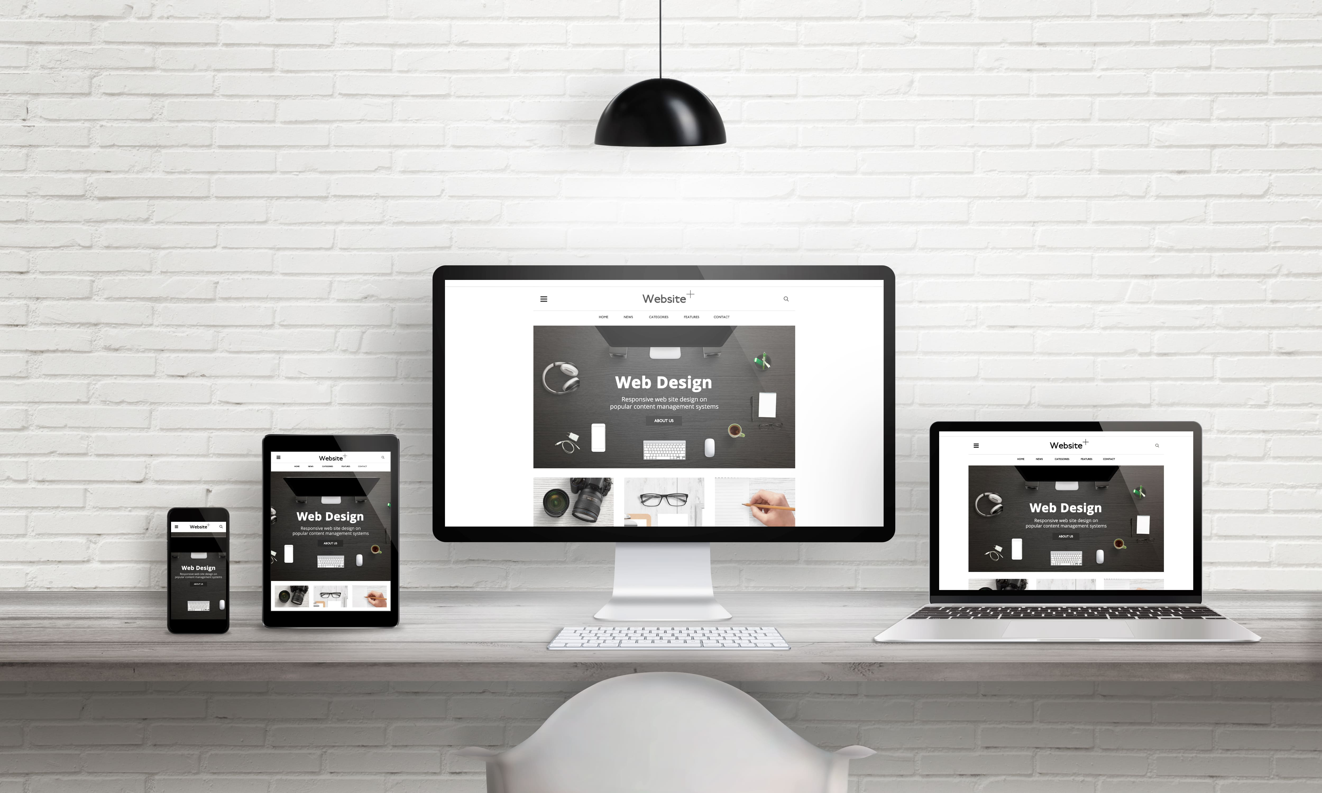
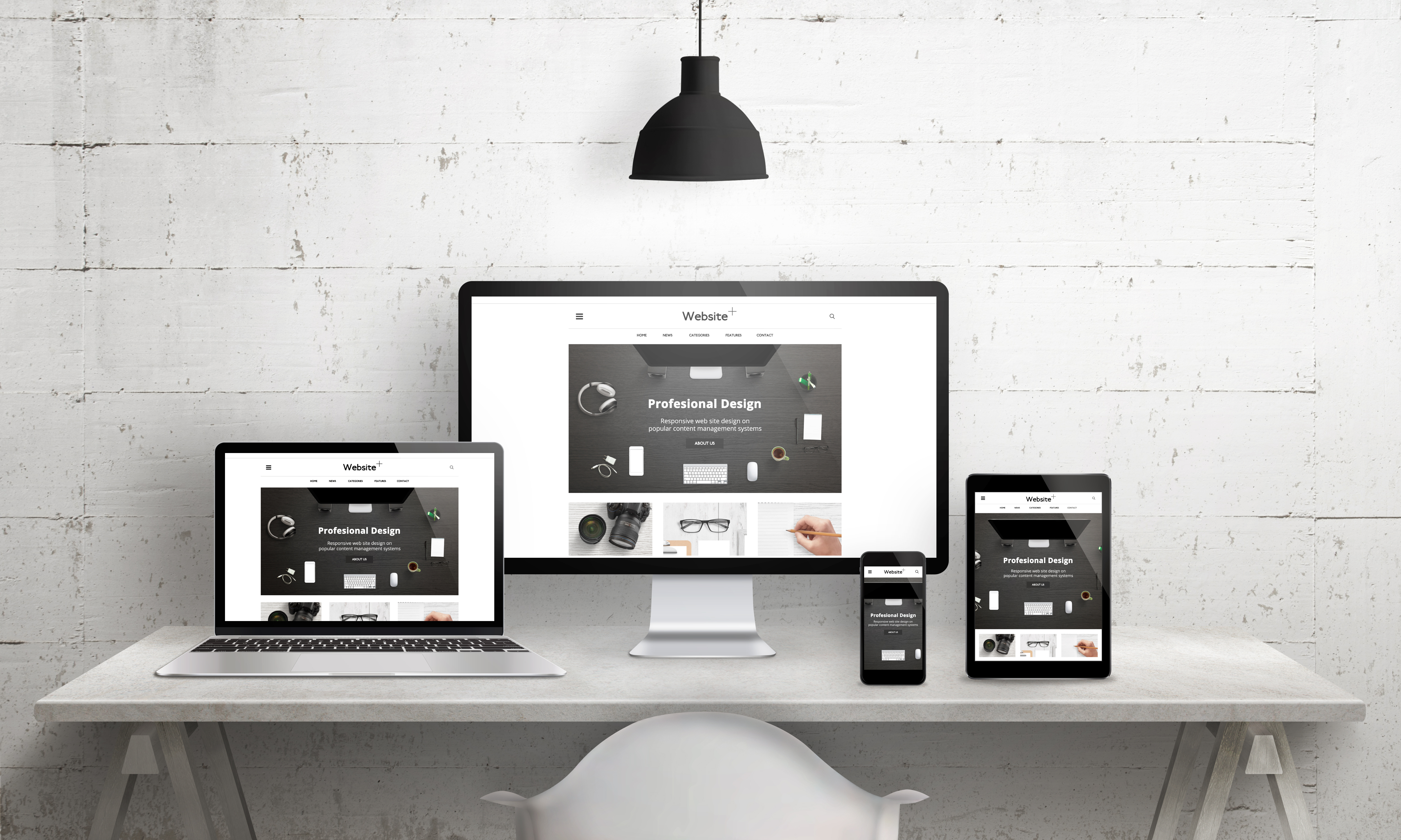
Mistake 6:Lack of responsive design,poor mobile experience
Currently,mobile pageviews have surpassed PC views,but many websites still focus only on PC design,neglecting mobile experience—for example,excessively small text on mobile pages,narrow button spacing,and content overflowing the screen,making it impossible for users to browse and operate normally on their mobile devices.
Avoidance methods:Adopt responsive design to ensure the website automatically adjusts its layout according to the screen size of different devices(phones,tablets,PCs);focus on optimizing button size,font clarity,and content layout on mobile devices to ensure a smooth user experience.
Mistake 7:Unclear or excessive Call to Action
One of the core purposes of a website is to guide users to complete specific actions,such as contacting customer service,purchasing products,or submitting forms.However,many websites have problems with their call to action:either the button text is vague(e.g.,"Click here"),leaving users unsure of what will happen after clicking;or there are too many call to action buttons,distracting users and leaving them confused.
Avoid these pitfalls:Each page should only have 1-2 core call-to-action buttons,placed in prominent locations(such as the top navigation bar,middle,or bottom of the page);the button text should be clear and concise,directly informing users of the benefits of their actions,such as"Consult Now to Get a Quote"or"Receive a Free Industry Guide."
III.Content and Functionality:Practicality is Key;Avoid Superficiality
Mistake 8:Empty Content,Keyword Stuffing,Lack of Value
Some websites,in an effort to optimize SEO,indiscriminately stuff keywords,resulting in illogical and valueless content;or the content is too simplistic and fails to answer user questions.This not only fails to attract users but will also be judged as low-quality content by search engines,negatively impacting rankings.
Avoid these pitfalls:Write content centered on user needs,ensuring it's authentic,useful,and solves real user problems;strategically arrange keywords,avoiding keyword stuffing,and ensure the content flows naturally;appropriately increase the depth and detail of the content,such as adding parameters and usage scenarios to product introductions.
Mistake 9:Overly Complex Forms
Many website consultation and registration forms have too many fields,such as requiring users to fill in name,phone number,company name,industry,and detailed needs.Overly complex forms increase the user's operational burden,causing many users to give up submitting due to the inconvenience.
Avoidance methods:Simplify form fields,retaining only core,essential information(such as name and contact information);mark non-essential fields as optional;add guiding text to reduce user wariness,such as indicating that we will contact you within one business day after you fill in the information.
Mistake 10:Neglecting Website Security and Follow-up Maintenance
Many companies neglect follow-up maintenance after launching their websites,such as failing to update website programs in a timely manner,not backing up data,and not enabling security protections.This makes the website vulnerable to hacker attacks,program vulnerabilities,and even data loss,causing unnecessary losses to the company.
Avoid these pitfalls:Regularly update website programs and plugins,patching known vulnerabilities;enable SSL certificates to ensure the security of user data transmission;regularly back up website data to prevent data loss;assign dedicated personnel to website maintenance,or entrust a professional website design company to provide maintenance services.
The core of website design is never a flashy appearance,but rather the needs of the users.The 10 common mistakes mentioned above essentially ignore user experience and the core value of the website.To create a popular website,you need to control multiple dimensions such as visual design,user experience,and content functionality,avoiding these pitfalls.