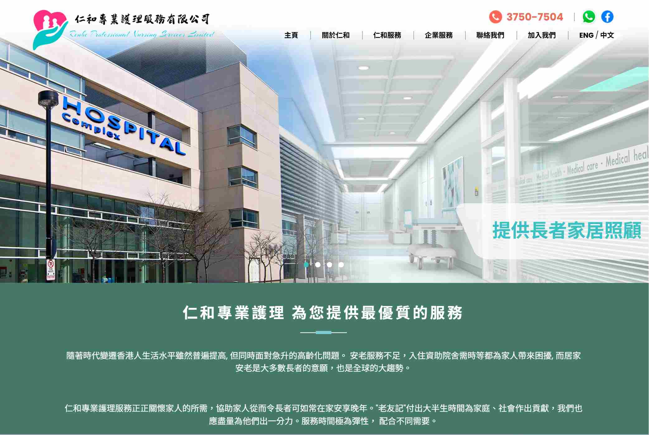
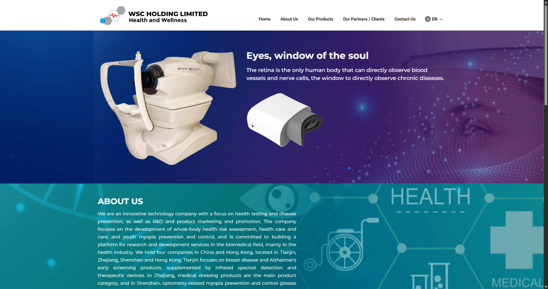
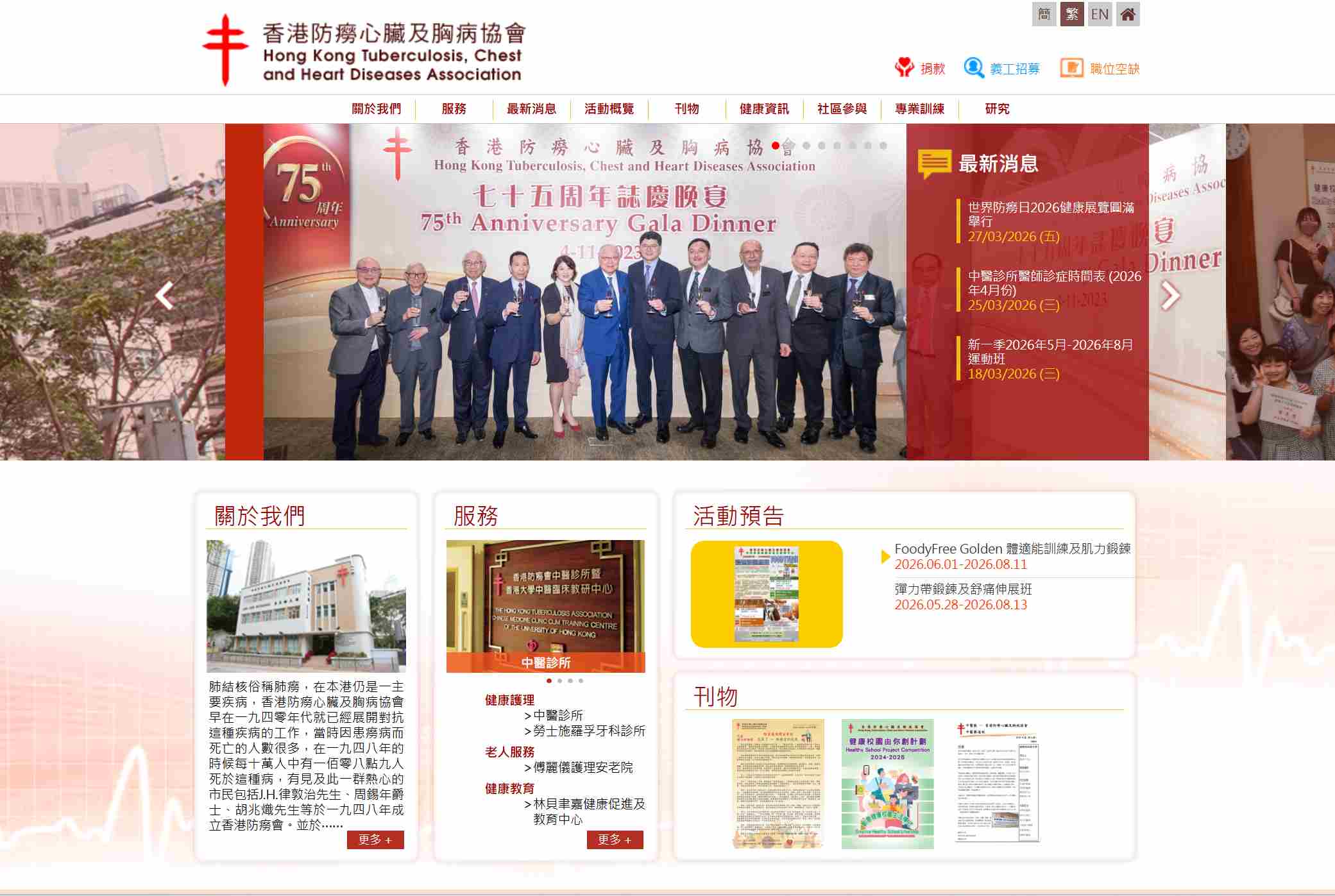
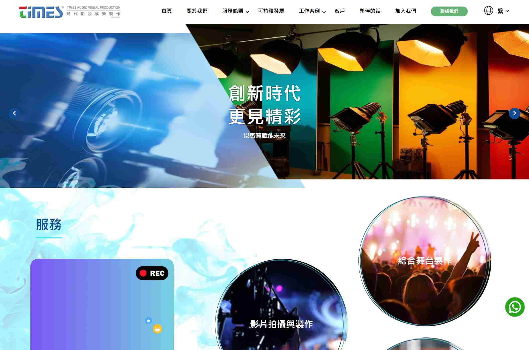
East Tech creates top-tier responsive website designs that adapt to various screen sizes, seamlessly transitioning from desktop to mobile. Combining smoothness and visual appeal across devices, it ensures a seamless browsing experience for users on any device, allowing brands to easily gain global user favor through mobile, tablet, and desktop interfaces.


